Neptune is a personal passion project of mine I started on June 2023. This application is all about managing stress and helping adults cope with burnout along with the pressures of being in the workforce. My aim is to bring the application to life and see through it's development process so that I can bring it to users who need a burnout buddy. This innovative app serves as a way for adults to cope with their work-related stress by providing them different ways to manage it. Whether it's through suggesting activities they can do locally or by soothing them with calming music, Neptune aims to give people means to regulate their stress and encourage them to seek out professional help.
• Research
• Ideation
• Design
• Prototype
• Prototype feedback
• Conclusion
• Recommendations
Filipino adults are having a hard time accessing new ways to regulate their stress. Most often, adults will tend to prefer to stay within their comfort zone. Neptune is all about exposing new ways to ease stress and encouraging users to seek out professional help so they may relieve their tension.
UX/ UI Designer and
Graphic Designer
“Neptune” is a mobile application that helps stakeholders understand what they need and suggest them ways to help themselves through giving them music to listen to, videos themed to relieve stress, breathing exercises to calm them down, articles they can learn from, and a directory to their nearest help centers. Users can also track their mood through journaling so they may learn more about themselves and track their progress.

In preparation for the project, I had to understand exactly what the application needed to do. This involved identifying key stakeholders, defining the project's scope, and conducting a review of relevant literature. The first thing I did was study about burnout and understand who are the biggest groups who experience it. During this process, I delved into research papers that explored the burnout statistics in the workforce and which fields commonly experience it. Additionally, I examined the current circumstances surrounding ways to manage burnout and stress amongst adults as well as look at other similar projects. I needed to see where the gaps were within the market and how my application could fill them.
Short-term goal:
Give primary users a way to get away from work for at least a few minutes.
Mid-term goal:
Give users a routine wherein they can relieve work-related stress by exploring the application's features.
Ultimate goal:
For users to maintain a work-life balance and bring healthy habits learned from the application to their job.
It was important to understand who the application will serve and what exactly users will want to accomplish when using the application. Following this, I derived what components that can work together to help users manage their burnout. I did this by examining a group of volunteers who were all within different stages of their career. Collecting insights from them gave me a clear vision of who the stakeholders were.


This part of the process was focused on creating components and the low-fidelity prototype of the application to present to testers. Before any wireframes were made, I interviewed volunteers to know what main components they wanted to see in the application as well as assess how frequently they would use it,
.jpg)
.png)
I created a prioritization matrix as well as assessed what features the application must have, should have, could have, and won't have. This gave me a way to focus on what really matters to the users and what features I should focus on perfecting. Predicted users flows were also visualized for main features so that I could have an idea of how the users would interact with the application.


To create the low-fidelity prototype, sketches of the application’s pages were done on paper. This was done to get a general gist of what the application’s UI will look like. These sketches were then translated into a primitive wirefram using Figma. After the low-fidelity prototype has gotten feedback from informal testing, I proceeded to planning the visuals of the application and starting the formal prototype.


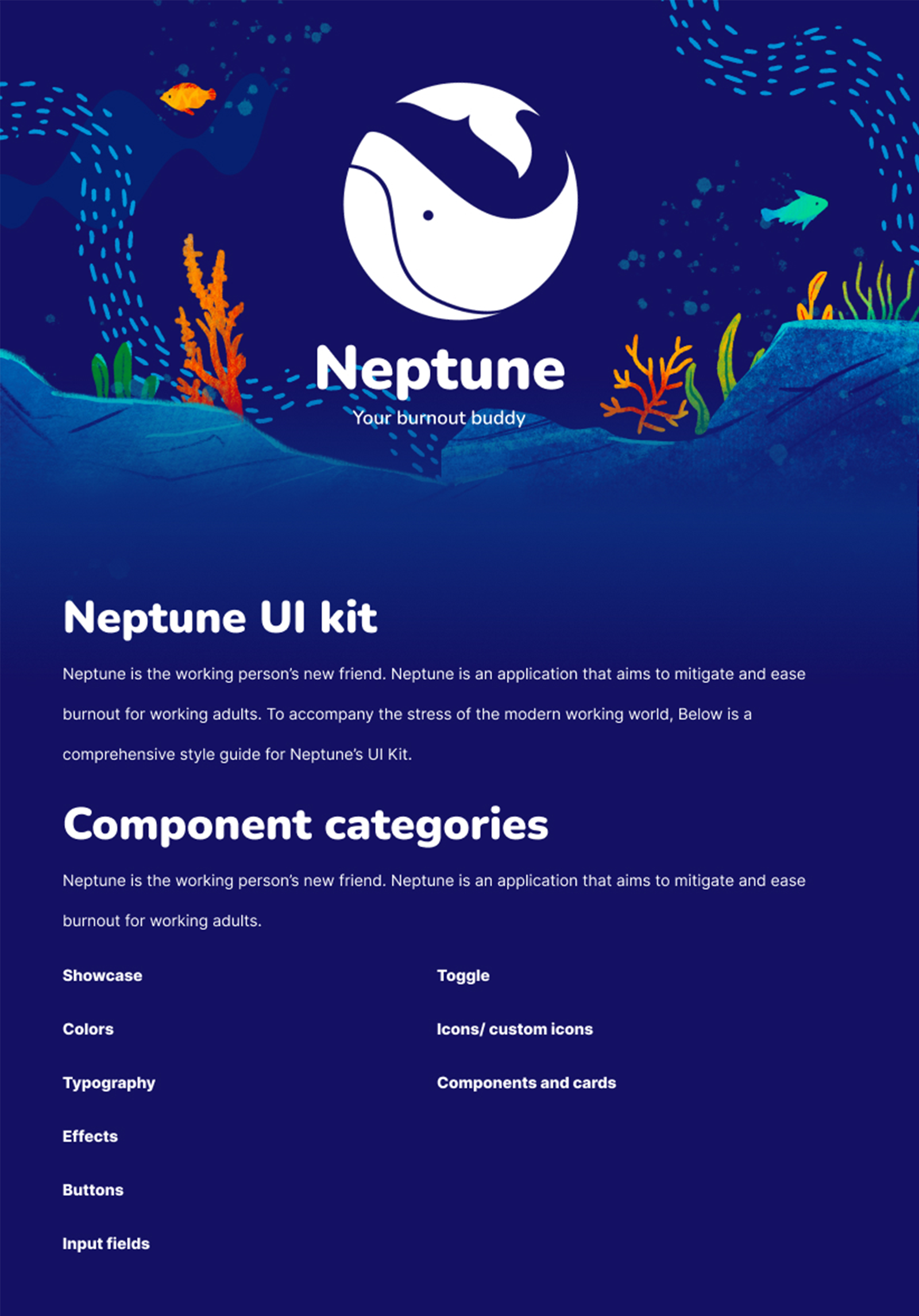
The design style of the Neptune app embraces a deep and calming aesthetic, aiming to create a visually pleasing and intuitive experience for its users. The overall design philosophy revolves around the oceans colorful yet tranquil visuals. Moreover, I wanted to create distinct voice and look for the application and opted to hand draw illustrations, making the application more inviting. Of course, this style also ensure plenty of room and adjustment to allow a functional and understandable user-interface.
A mood board was first created to pitch the overall feel and visuals I wanted the app to portray. I needed to ensure that the visuals and main branding would attract and please users while also leaving space for a proper user interface. Thus, this mood board has the logo, colors, typography, and type hierarchy of the app.


After creating the mood board and brand assets, I proceeded to create a style guide to have key components, cards, local text styles, local color styles, and local variable styles ready when I create the high-fidelity prototype. Using Figma's tools and local style feature, I was able to create sections for a style guide to organize all necessary components. Below are pictures of how I arranged Neptune's style guide.


You can see the original low-fidelity wireframe and style guide through the button below. This will bring you to the Figma file of Neptune so you can see how I organize Neptune's components, wireframes, and prototypes, Feel free to leave comments!

.png)
Neptune's seas are finally open to you! The high-fidelity prototype was created in order for informal testing to occur. This prototype features the login process, the process to create a journal entry, the whole explore page, profile page, and the emergency help process. This prototype was created using the tools in Figma, so click the button below to experience what Neptune would be like!
This prototype was informally tested due to time constraints and users mentioned that they found the application easy to navigate, welcoming and accessible, as well as pleasing to the eyes due to it's unique visuals. Testers also found the journal feature innovative and the emergency help button significant to the core of the application. However, testers commented on having a light mode and dark mode would make the application more accessible to more demographics. They also mentioned they wanted more moods for the mood journal and that a physical journal can be added as well to make the app integrate more in their life.
This application's prototype is ready for you test and explore. Neptune's seas are open to anybody who wants to take a dip into the cool waters to relieve themselves from severe burnout.
Go through the login process, get to the mood journal, read through articles, listen to music, watch amazing videos, and look through the help directory. All features of the app are open for you to enjoy! Please feel free to leave comments as well!

Millions of Filipino adults experience burnout due to work and stress. There needs to be ways to mitigate or ease their burnout. Neptune acts as the first step to helping those with burnout. Neptune provides activities and ways to calm down while also offering an avenue to reach out to professional help. The application is also a way for users to track their mood and see the progress they’ve made emotionally.
Further development could see rigorous testing and proper testing on app’s efficacy and visuals. Neptune can also add more features like sleep tracking and community spaces. Lastly, Neptune’s visuals could be further integrated to the applications UI system. Comments made by the informal testers can be integrated as well, especially the mention of having a dedicated dark and light mode.
The following are UX/UI design case studies and visual designs I have developed over the years. Check them out below to see related projects.
.gif)


I'd love to hear from you about what kind of work you're looking for or if you have any questions about how I could help you achieve your goals. If you want a friendly person who loves to make people's lives easier by creating compelling designs, let's have a chat!